


"In many ways, the work of a critic is easy. We risk
very little, yet enjoy a position over those who offer up their work and their
selves to our judgment. We thrive on negative criticism, which is fun to write
and to read. But the bitter truth we critics must face is that in the grand
scheme of things, the average piece of junk is probably more meaningful than
our criticism designating it so." -Anton Ego from Ratatouille
Before I start, I'm sorry. It’s a grade nothing personal. Enjoy! :)
You have a good looking blog. I like the color choices. The
text is also really easy to read. One thing you could probably improve on is your blog's title. I enjoyed reading through you blogs. You
write well!
No one in the world other than the few people involved in
this class is going to know what IT 104 is. I would change the title, if it
were me. I don't know what it is about the color choices, but they make me want
to leave the page as soon as I got to it. Other than that things look like they
are going smoothly!
Your blog is kind of plain. The font color does show up really well off the grey. I believe you have some broken images in your guest blog you might want to repair. I also think your about me would look better above the blog archive.
Intermission: Old but Gold
Ted ( http://computertechsystems.blogspot.com )
The visuals of your blog look good. The background isn't distracting from the content at all. Your photos look good as well. It looks like you are really utilizing Skitch! The only thing I really don't like is your blog's title, "Computers." That makes me not want to read any further, because it's a boring title.
That font color and font style is somewhat hard to read. It may just be the color but it looks odd. Paragraphs (multiple) rather than a paragraph will do a world of wonders as well. The image background is a good picture. I'm not really sure what is going on with your sidebars either.
You do a really good job writing. However, the orange font is a little too much for my eyes. The size of it is also too big, almost the same size as your blogs title. You did a really good job with your pictures, but I think their might be too many. They are also huge. I feel like I am scrolling through pictures trying to find some text.
Intermission: Why am I not there?

Tyler ( http://jimison0tyler.blogspot.com )
Save a horse, ride a turtle? I like it. The three pictures I see on your blog are good. They add a not so serious feel of things. You should consider adding a few more. Other than that things look good. Best heading I have seen thus far.
Jane ( http://janiegirls.blogspot.com/ )
You have some really great pictures, but you might want to consider not putting them so close together. It messes with some of the text. In your "Open Office or Libre?" blog, you have two different font sizes. Things look good though, great job!
Scotty ( http://thephoenixhub.blogspot.com )
The blog looks really good. The colors aren't too much and good pictures. There are a few minor things that need fixed. For example, the text in the guest blog with the text background color, and the picture width in your gmail blog is too wide. Things look good.
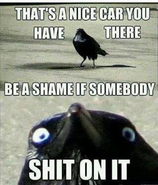
Intermission: Damn Birds
Amber ( http://amberdawnzie.blogspot.com )
Your colors flow well together. The calender looks somewhat out of place though. The pictures are great, and the blogs are well written. There is something funky going on with the guest blog though. The third extension has a white text background and black text. It matches nothing else on the blog. As a friend, I will add that you suck, not your blog. : )
Chris W. ( http://whittstopher.blogspot.com )
Your blog looks really good. I would try to find a better title other than IT Fall of 2013. I would also add some pictures to the earlier blogs. Great blog.
Chris B. ( http://lordsfallenpaladin.blogspot.com )
You still aren't on the Evernote Email and Blog Links. I don't think that is your fault though. Anyways, on to the blog critique. Looks like you are doing a great job, it looks and reads good. I like that you also took screen shops of the apps in the Evernote and Springpad blog. Good job.
Come to find out it was Matt's fault, but (dust's off shoulder) I fixed that...
ReplyDelete